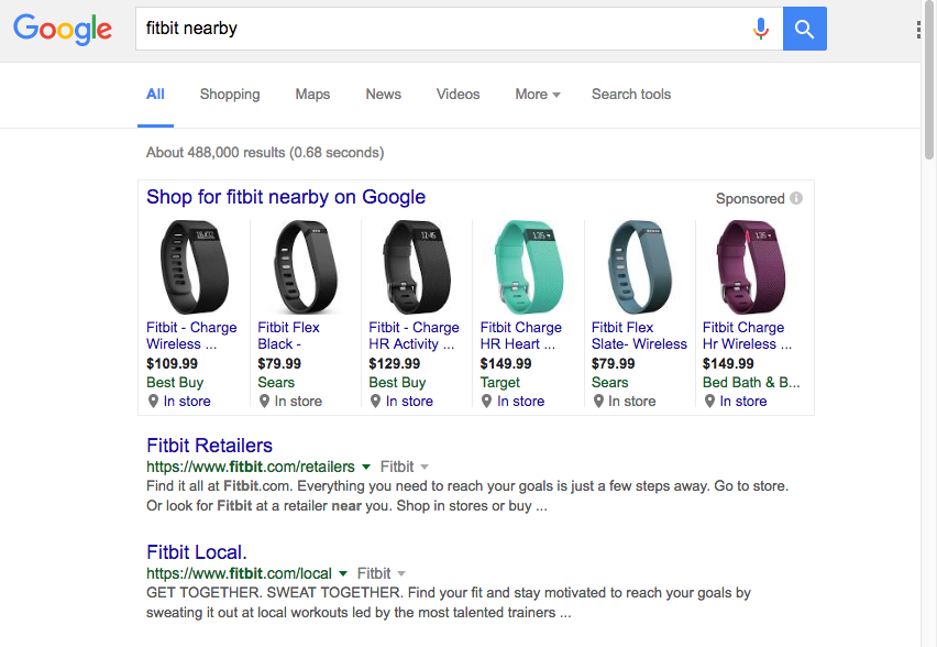
We just caught Google testing a new look for Google Shopping today. The current design is shown below and has all the Google Shopping results grouped together in a grey bordered box.
This new Google Shopping layout has a distinct grey bordered box around each result, and also takes the “Sponsored” message out of the boxes, making the Shopping results seem less ad-like.
Lastly, in one of the largest shifts of all there is now also a way to scroll sideways to see more results. This is similar to the swiping motion Google has on mobile results.
What do you think about the new design?

Brian Roizen is the Cofounder and Chief Architect of Feedonomics, a full-service feed optimization platform that optimizes product data for hundreds of channels. He has been featured on numerous podcasts and eCommerce webinars, and regularly contributes to Search Engine Land and other industry-leading blogs. Brian graduated summa cum laude from UCLA with both a Bachelor’s and Master’s degree in Mechanical Engineering.


